Our list should give you some indication of the key web trends we expect to grow in importance.
Sometimes the most effective site is the least complex one. A lot of the time we’ve suggested one-page sites for start-ups and businesses that are just getting active for the first time on the web. We think they are going to become more popular with personal brand building particularly with the death of the CV. LinkedIn is awash right now with posts about how CVs are outdated. Indi Harris is a cool example of a simplified example of a digital CV. It does all it needs to be able to see her experience and connect with her but in a visual way.
One-page sites work best when their subject matter is narrower, like a portfolio or the presentation of a single idea. We’re all about creating content to show off your business in the best light possible. There’s no point in having lots of pages if the content you’re adding into them is not serving a purpose. We don't believe in content for content’s sake. It must have purpose
The coffee shop website we created for start-up company, Bentley’s Coffee Shop is a perfect example of understanding your capabilities and resources. The team have been non-stop in securing new locations for their business and the stress of needing to upkeep their website was one they just didn’t need at the beginning of their journey. They knew the importance of having a great web presence for their customers to find them online but wanted to start small. We gave them the addition of a blog so that they could share news about their latest locations and behind the scenes stories.
Maybe we are all just compensating for missing the opportunity to travel like we used to, but some websites seem to be gaining more sense of place. We are seeing photographs of local places featured on homepages and about sections calling attention to cities, towns, and natural places around where we all live.
The web can be a detached place where you often have no connection to where the site you’re browsing is coming from. We seem to have become more about loving where we live. Think we have the pandemic to blame for that but it's a good thing. It's maybe re-centred us.
We used this importance of loving where you live recently on the hairdresser website we built for Poppys Hairdressing. Hartlepool is where the business launched in 2006 and is important to them in their story telling about where they sit in the community to this day. They don't use generic stock photographics of Hartlepool, either. The business owner has invested in a library of inside and outside of the salon images that they can swap in and out of the website and their content marketing.
As the first part of a web page that visitors see, the hero image needs to make a statement. Many web designers, ourselves included, are taking that idea to heart with typography-led hero images.
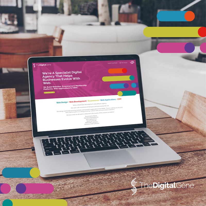
Our own web development website design is based around having a strong call to action text feature on all the hero sections of every important page. It’s vital that the visitor understands immediately what you can do for them. It's all about solving their problems not blowing your own trumpet. This messaging should be able to be changed as many times as you need. It’s important to have a website you can make easy quick changes to in the CMS yourself. Don’t buy into a package that looks good value for money at the outset but means you’ll be charged for every little tweak you need because your web developer doesn’t allow you to do it yourself. We build websites that can be used by one person or full on marketing teams.
Essentially, hero sections can reduce or eliminate imagery altogether to allow the message itself to carry the weight of the first impression. Rather than coming across as bare, these hero sections are bold in their simplicity. They command attention the way a captivating news headline does. The importance of a strong Call To Action should never be overlooked. Along the way, they provide an excellent showcase for some tasteful, creative lettering styles
We have noticed a lot more websites moving toward inclusive content and language in their designs. This should be a norm, and hopefully, this is a permanent shift toward a more universal awareness of the impact of language. More inclusive copy makes the web a place that is more welcoming and more accessible to more people. After all. that's the sort of place it should and needs to be.
It's something we feel strongly about and will be implementing and suggesting on all our 2022 web design projects.
It’s not just what you say, it’s also how and where you say it. Alt text, legible text (font, size, and colour), and avoiding text-as-image are all ways of making sure everyone will be able to read what your site has to say, regardless of language or ability. We see so much text as image usage on websites that even by making this one clean up job a priority would mean an enormous difference in their accessibility.
Webflow have created a useful blog post about accessible web design and while many of the avant garde ideas can seem to swing against accessibility it’s important to find a happy medium. After all, the web should be for everybody.
Supporting operating system features such as dark mode (so your website doesn’t hurt your eyes when you’re surfing the web at night), and accessibility features like font scaling and contrast adjustment are becoming much more widely implemented and we aim to be at the forefront of implementing this for our client projects.
These features tell your customer that you’re thinking about their needs and desires, and you’re helping to accommodate them with the design of your site. Sites that do this stand out in your customers’ minds, because they’ve intentionally made the choice to use these features on their devices – if your site supports them, your visitors will notice and become loyal to you.
Webaccessibility.com is a great tool for making a start and finding out what improvements you need to look t making. Our own website scores on average 93% and we are pleased with that as we work hard to keep it that way. Always room for improvement, though.
We wonder if we will see the same approach to gender neutral design and inclusion as we are starting to see towards accessibility design? As much as one of my favourite colours is pink, I do not want to visit a site that uses pink as a way to express femininity. Nor should we be creating overtly masculine web design with the use of black and red and images that mean only men can be personal fitness trainers or drink protein shakes. Men like pink, too. We’ve got a long way to go on gender neutral design but if we make small steps, they’ll help make a difference.
The one thing I do think needs to go is the pronoun choices when completing an online form or making a purchase on an ecommerce website. For so long I’ve personally hated that I’ve had to select Mrs or Ms or choosing if I’m male or female. It might matter in some small cases but not if you’re buying most things. We don’t have to advise the checkout operator at the supermarket about our gender identity so why when we are buying something online? I know it’s all about collecting data for future target marketing, but we should be getting savvier than this and allowing the user to choose more freely their own marketing segments.
On the technical side, page speed continues to be a front-of-mind consideration for web developers. I know it does for us. We never stop thinking about it. Google’s 2021 algorithm update makes speed a more important consideration than ever before for SEO. This also reflects users’ higher expectations for site speed performance and how users will abandon a page that takes more than 3 seconds to load. Gone are the days of patiently waiting on loading screens. Speed is now even a Google landing page ranking factor for ads. There's never been a more important time to begin housekeeping your existing website even if the outcome is that your current one is too outdated to improve. You must bite the bullet if you're going to compete whatever your industry.
Do you know how slow really does kill? Cloudflare wrote an in-depth report about how the clock ticking against your page loading can make a significant difference to your website's conversion rate. Conversion essentially means making money.
Google PageSpeed Insights or Lighthouse are great tools that can be used to assess your page speed optimisation. There are also a few simple steps we as web developers can take to make sure pages load quickly like image optimisation and deferred offscreen image loading. At The Digital Gene we also resource our clients on how to continually optimise their website themselves.
Dynamic content allows designers to build faster, build bigger, and include more complexity without increasing the amount of labour required to adjust. We’ve implemented this in our own Gene-ius content management system so that dynamic content is built around a database linked to repeated structures. This makes repetitive tasks easy and quick for example to create new pages or sections of pages.
As designers have always known, typography can do more than convey information.
Animation is of course nothing new to web design, but it is usually reserved for illustrated graphics, UI elements, and page transitions. For that reason, moving text can come as fresh and unexpected, even when the animations are simple—as circular rotations and side-scrolling “news tickers” are. These small touches allow the typography to take centre stage without overwhelming the reader with gimmicky animated gags. We’ve used some simple moving text on the membership site we created for No Cash Club. We used it as a way to draw attention to the vast amount of breadth of skill swapping that will be available when the site officially goes live in 2022.
Reliance on digital tools can make it so easy to miss out on that sense of personality you get with imperfect, handmade artwork. That’s why, for 2022, we expect an increase in DIY graphics to emerge. These can include scribbles and doodles, messy cut outs, and analogue textures like crayons and paint. The effect is to bridge the gap between online and off, to ground these too often interchangeable screens to the real world through a human touch. I definitely think we'll be adding more doodles to our designs.
We accented this will writing website with doodle style imagery and we also created doodle style brand assets for this financial services website to give it a personal, welcoming feel when talking about people’s finances and mortgages.
I think this is something we’ll start hearing more and more about and just like web accessibility, The Digital Gene wants to be at the forefront of sustainable web design and development. We’ll need to make changes, too. We’ve recognised this. A lot of the design ideas in future years will be as much about people and culture and positive mindset as much as they are about implementing the service changes. We’ll lead from the front first. Watch this space for more news in our 2022 Manifesto.
I think you'll agree there's lots of opportunities and web trend areas to think about for 2022 and beyond. We know what a challenge this can sometimes seem in terms of improving your site and how it can appear a bit overwhelming on finding a starting point.
Do get in touch if you need to chat anything through with one of us. That's what we're here for.
We've also created a list for FAQs for visitors to help make informed decisions about our business and our expertise.